A landing page has one job: to turn visitors into leads or customers. For people arriving from an advert who know little about you, it needs to make a great first impression, fast – with the right message, the right proof and one clear next step.
The examples here come mainly from universities, the sector I’ve worked in most, but the principles apply to every industry.
Plan before you write
1. Know your audience
Start with a customer persona so you can put yourself in your visitors’ shoes. You don’t need complex research: your own insights, sector reports and quick customer surveys go a long way. Answer these questions:
- Who are they, and what are their main goals?
- What motivates them, and what’s stopping them?
- What do they want to know, and where do they want to go next?
- What kind of content will they respond to?
2. Build around a big idea
The best campaigns are built on a creative idea that goes beyond features and benefits, tapping into deeper motivations: to achieve, to belong, to explore, to be extraordinary. Your idea should evoke emotion, because emotions drive decisions – and it should sound like your brand.
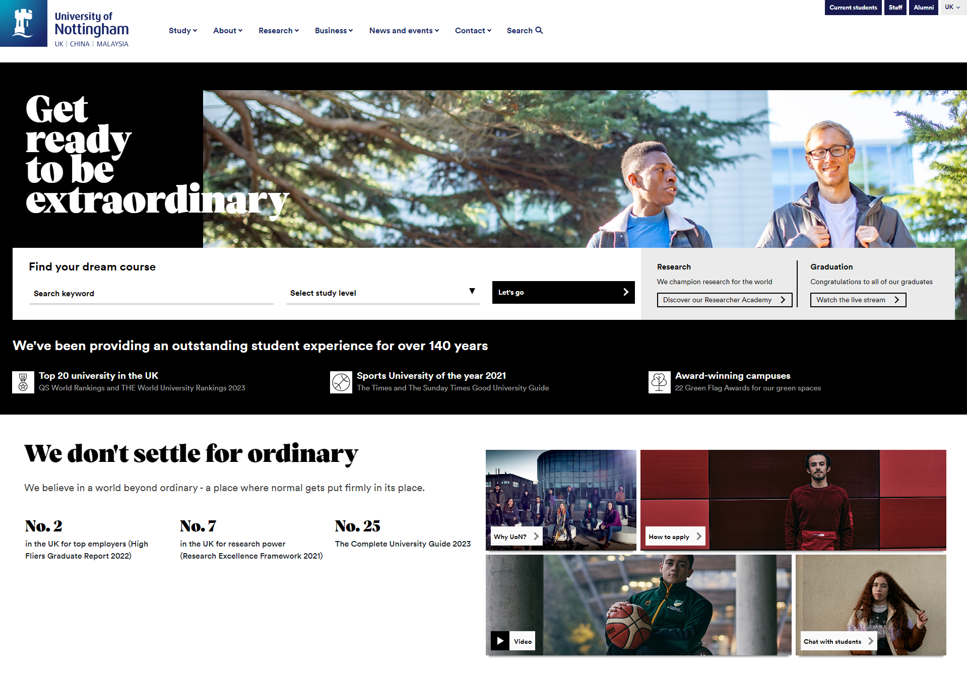
Universities have embraced this too. The University of Nottingham’s ‘Get ready to be extraordinary’ campaign, for example, carried its idea right through the page, not just the headline. Once you have your idea, let your adverts and landing page embrace it fully. It makes writing everything else easier.
Write and design for conversion
3. Lead with your value proposition
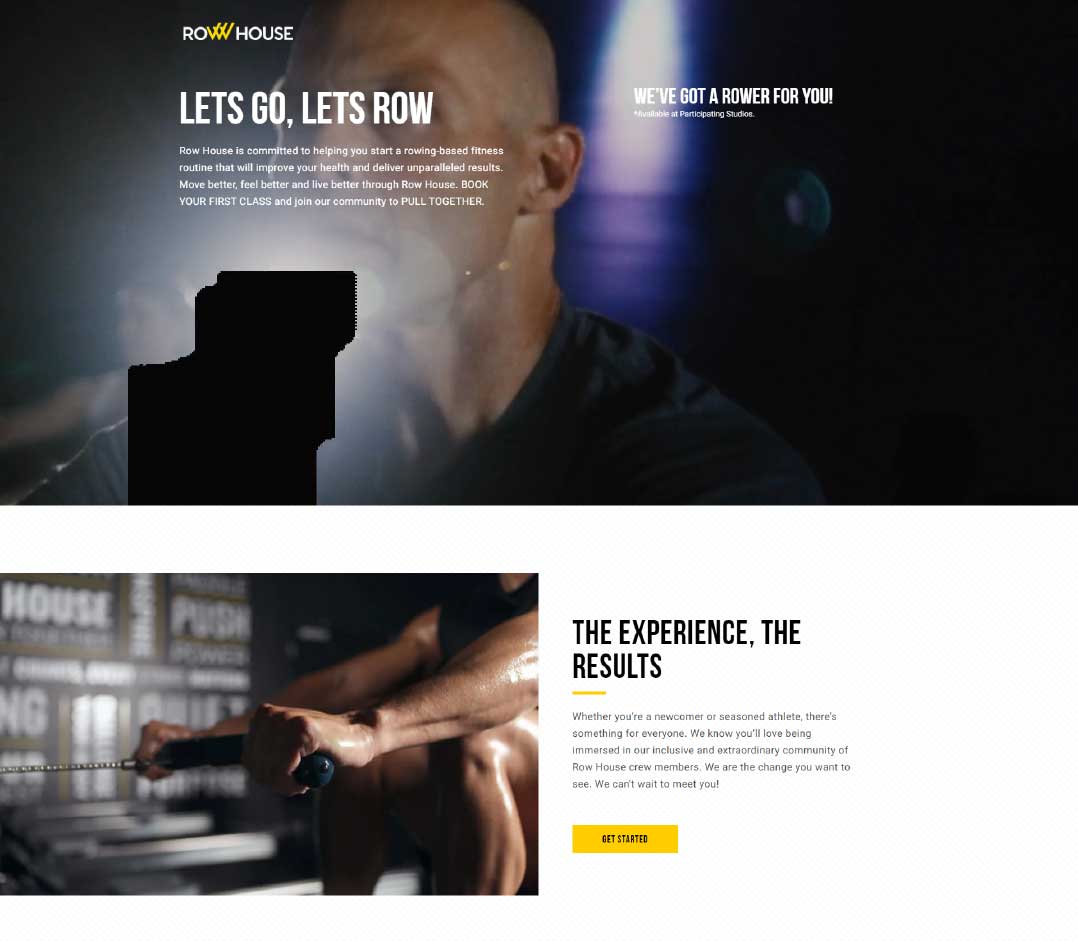
Put your most powerful message at the top, where you have your visitors’ attention. Lead with your value proposition: the number one reason you’re right for them. It should answer the question every visitor is asking: ‘What’s in it for me?’ Check what competitors are saying, and make sure yours stands out.
4. Write benefit-focused copy
Speak directly to your reader, using ‘you’ and ‘your’. Keep to one idea per sentence and short paragraphs, so people can grasp your offer at a glance. A handy framework is to make your copy:
- Clear: plain, conversational language your customers use, with a logical structure.
- Concise: the essential information, and nothing more.
- Credible: facts and proof, not opinions.
- Compelling: benefits as well as features, with words that create an emotional response.
5. Use headings people can skim
Many visitors will only read your headings, so make each one carry a benefit. Get creative, even with everyday topics:
- Employability: Degrees that matter in the real world
- Flexible study: Timetables to suit you
- Financial support: Finances: making it possible
6. Balance words with images and video
Don’t overload your page with copy. Use images and video that reflect your audience, tell a story and reinforce your message.
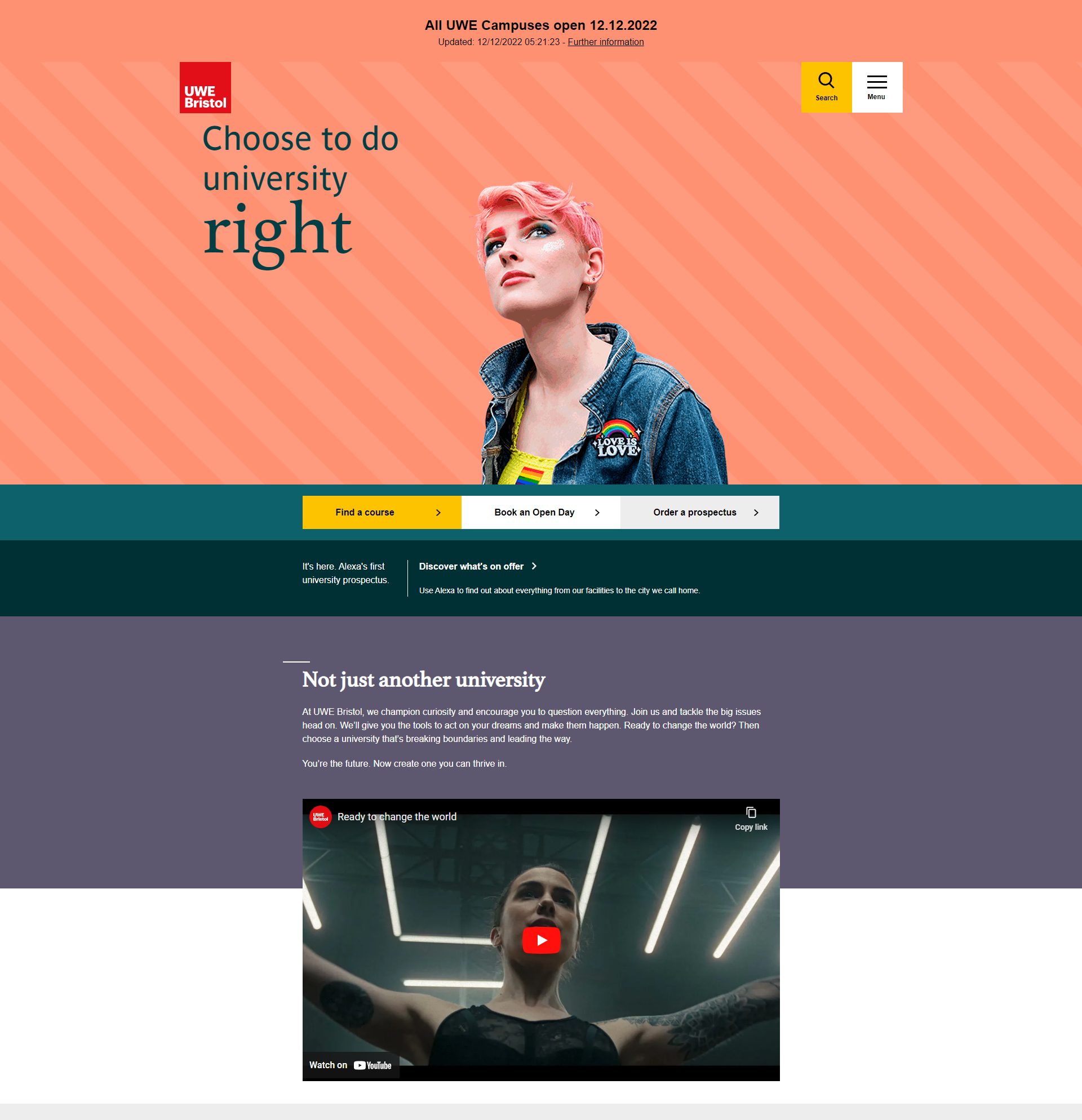
7. Design for mobile first
More than half of web traffic now comes from phones, and for campaigns driven by social media it’s often far higher. Keep graphics simple, copy short and buttons easy to tap.
8. Show your trust signals
Make proof stand out with its own space on the page, using images and logos where you can:
- customer quotes, reviews and case studies
- media coverage and endorsements
- statistics that quantify your quality
- awards and accreditations – even shortlistings count
9. Remove distractions
Strip out main navigation, competing links and alternative options, so visitors focus on your message and your call to action.
Make the call to action irresistible
10. Create a persuasive offer
Your offer is what people get in exchange for their details or their click: a guide, an event, a consultation or a discount. Describe it in terms of its value to them:
Instead of: Book your place at our open event
Try: Discover more at our virtual open event, designed to help you find out if we’re the right fit for you
Instead of: Sign up for emails
Try: Join our community for news and tips about student life
11. Make the button stand out
Use a contrasting colour and a short, active phrase that says exactly what happens next, such as Book now or Download the guide. Repeat it down the page so people can act when they’re ready, and test action-focused wording (Book now) against benefit-focused wording (Meet us in person).
12. Put a call to action near the top
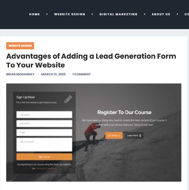
Make it easy for people who are ready to act straight away: include your form, or a link to it, near the top of the page.
13. Only ask for what you need
Every extra form field puts people off. A name and email address are often enough to start a relationship – check with your CRM team that your fields match what they need.
14. Say thank you
Always follow a sign-up with a thank-you message or page. Use it to thank people, confirm what happens next, and point them to more useful content to keep the relationship moving.
Get found, stay accessible, keep improving
15. Optimise for search
Use your target keywords naturally in your title, headings and copy, especially if you’re running paid search ads – the words people searched for should appear on the page they land on. But never let keywords spoil your message.
16. Make it accessible
Your page should work for everyone, including people with disabilities. Follow the Web Content Accessibility Guidelines (WCAG) and remember the basics:
- use plain English and a readable font
- structure content with proper headings
- write descriptive link text, not ‘click here’
- add alt text to meaningful images
- check colour contrast, especially on buttons
17. Measure and improve
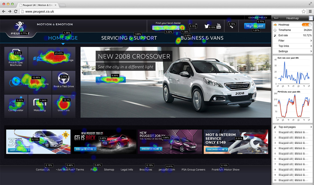
Track what matters most: how many people take your call to action. Use Google Analytics for traffic and conversions, heatmap tools such as Microsoft Clarity or Hotjar to see how people use the page, and your CRM to follow leads through to sales.
Bringing it together
A great landing page combines a clear understanding of your audience, a big idea, persuasive copy and a frictionless path to action. Get those right, keep testing, and your campaigns will work much harder.
Need landing pages that convert? I plan and write campaign landing pages that turn clicks into leads. Get in touch to find out more.