Content design for website landing pages
Landing pages provide quality experiences for users and drive conversions or sales using targeted messaging.
They contain value propositions and trust signals, communicating how your product or service addresses customer needs and pain points. Content is powerful and skimmable, including strong CTAs (calls to action) that persuade users to complete a lead generation form or click through to specific content.
The landing pages I’m discussing are designed to meet the needs of relatively ‘cold’ leads (unfamiliar with your product, service or brand), usually arriving directly from adverts. They focus on improving brand awareness and lead generation.
Your landing page needs to work hard. It needs to deliver a customised, relevant and, most importantly, memorable, experience – using a solid format, strong multimedia and well-crafted copy to drive conversion.
You’ll need to promote the best bits of your offer – the first important part of building positive interest in your brand. Subsequent marketing activities – further advertising, emails, direct mail and more – will strengthen this relationship to gain and retain your audience’s custom.
This blog mainly contains examples relevant to university landing pages, as this is the main sector I work in. However, the information provided is relevant to every industry.
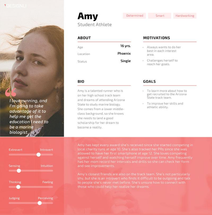
Your customer persona
Before you do anything, you need to develop a customer persona to help you understand who your prospective customers are, what they want and why.
Get this written down or even designed into a simple graphic. This will help you to put yourself in your audience’s shoes – a great way to keep them front of mind while you’re creating content.
There’s a time and a place for specialist tools, in-depth interviews and complex datasets; but you can also do a lot with a little.
Use your own insights, sector research and customer surveys to gather the information you need. You can ask your customers direct questions in person, via email or using quick online polls.
Here are a few essential questions to answer:
- Who is your audience?
- What are their main and other goals?
- What motivates them?
- What is their main barrier to achieving their motivations and goals?
- What do they want to know?
- Where do they want to go next?
- What kind of content will they respond to?
Your creative campaign idea
Every advertising campaign worth its weight in gold is based on a creative advertising idea that captures attention. This idea goes beyond the practical features and benefits of products, tapping into intrinsic human motivators to be the best, to be unique, to have fun, to explore, to belong etc. etc.
Brands spend millions on clever advertising ideas. Why? Because they’re competing fiercely for attention. According to a report from SJ Insights, we’re exposed to an average of 5,000 advertisements and brands each day!
But winning ideas can also be developed by you and your team with a bit of audience insight and creative thinking. Your idea should evoke emotion, because emotions drive decisions. It should also express your brand voice.
Even the best universities are now using bold advertising ideas to help them stand out. Here are a few examples:
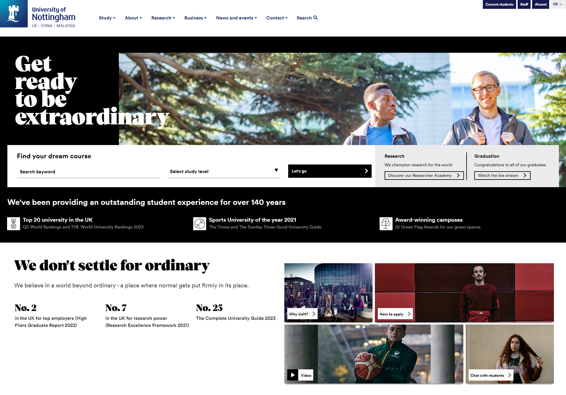
- University of Nottingham: Get Ready to be Extraordinary (see example below)
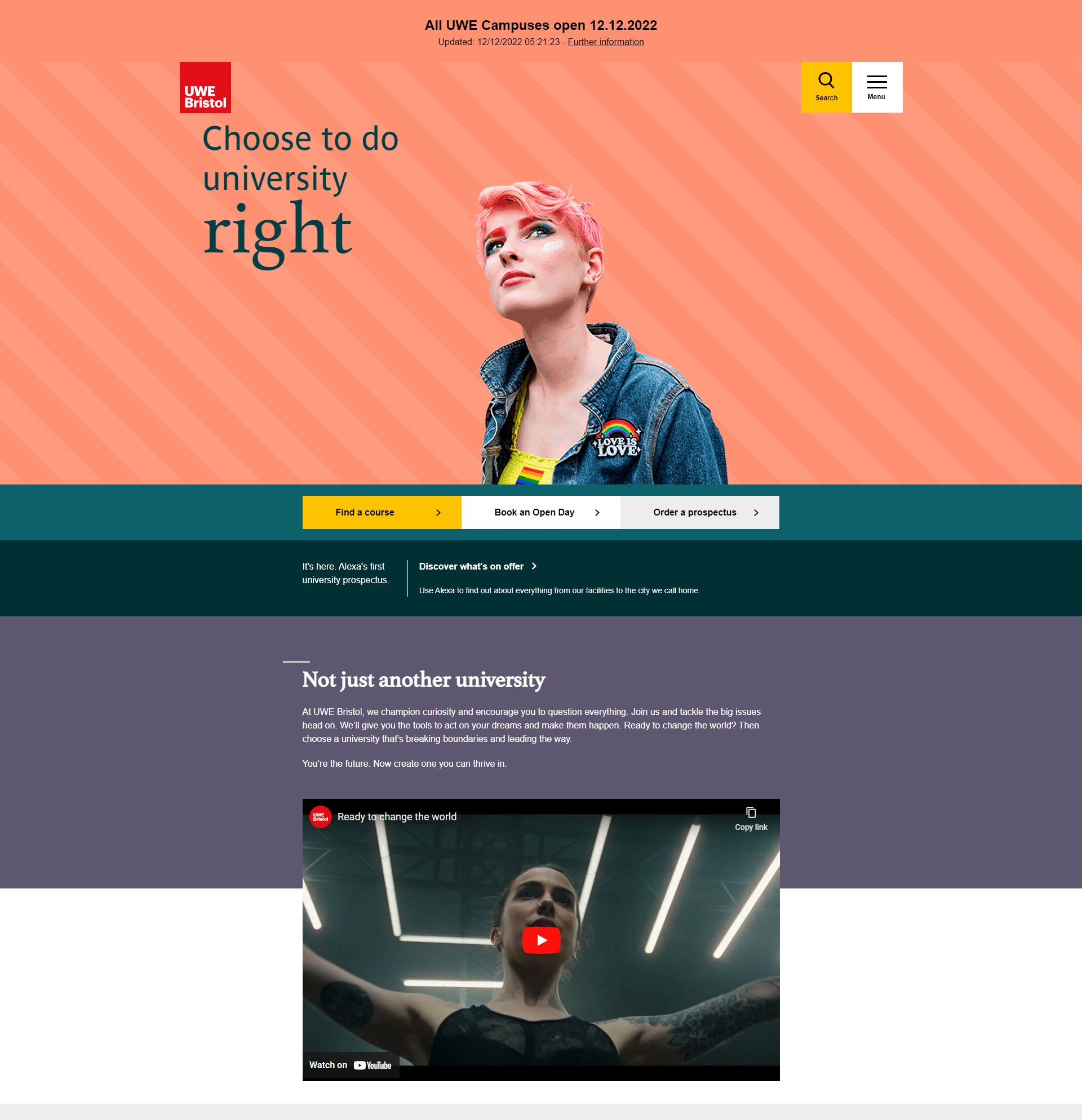
- University of the West of England: Do university right (see example in Publish eye-catching images and video section)
- University of Birmingham: Our global university and ambitious city
- Cardiff University: Expanding Horizons
- Hartpury University: Do What you Love
Invest in your creative idea. Then ensure your adverts and campaign landing page embrace it fully. Branding should be prominent and your stories should be built around this campaign hook. In fact, having an idea to focus your content on makes developing content a lot easier, providing you with a clear focus.
Make your page responsive
Just like every other page on your website, your landing pages need to be responsive to different devices. In fact, mobile needs to come first. According to Statcounter, around 60% of your users will be viewing your landing page from a mobile phone.
Keep graphics simple and copy short and snappy to suit these small screens.
Develop benefit-focused copy
Your copy needs to be clear and concise. It should guide your visitor to the action you want them to complete.
Compelling copy speaks directly to audiences by using you and your to make them feel engaged. Using we instead of your business name also feels more personal, helping to strengthen relationships and loyalty.
As a rule of thumb, use one idea per sentence, at no more than 20 words. And keep paragraphs short and snappy, making it easy for your audience to engage.
According to Microsoft research delivered by Statistic Brain, you have eight seconds to convince users to stay on your page, so it’s vital that visitors can capture the essence of your offer with a quick glance.
Here’s a handy framework for copywriting that sells:
- Clear: Use plain, conversational language that your customers use. It should be easy to read and well-structured, with a proper information hierarchy.
- Concise: Get to the point quickly. Provide essential information to inform and interest your audience – and nothing more.
- Credible: Use facts rather than opinions, including trust signals, which I’ll cover shortly.
- Compelling: Balance features with benefits, and use powerful words to create emotional impact.
Place your most important content at the top of your page
Always place your most powerful messages at the top of your page. Why? Because this is when you have your audience’s interest – as they scroll down, you’ll lose it.
Lead with your value proposition (in other words, your elevator pitch). This should tell your customers the number one reason why your product, service or brand is best suited to them. It should answer the question, ‘What’s in it for me?’
Communicate this directly and concisely at the top of your page, so it can’t be missed. Underpin it with your big idea, making it unique (check out what competitors are saying to make sure yours stands out) and specific to your audience’s motivators.
Remember, it needs to be persuasive; it needs to work hard to turn your prospects into paying customers.
Use headlines throughout to break up your messaging
Breaking up your copy with headlines will enable your readers to easily skim your page and still connect with your most important messages.
Your headlines should clearly communicate the value (benefits) of your offer and incorporate trending keywords, wherever possible (see Optimise for search section below).
Be creative and aspirational, wherever you can, drawing on your creative advertising idea.
University marketers, you can get creative with even the most ordinary of topics:
- Showcasing employability prospects, try something like Degrees that matter in the real world.
- Trying to promote flexible study modes? How about Timetables to suit you?
- Communicating information about financial support? What about Finances: making it possible.
These are just quick ideas; I’m sure you can do much better, but hopefully you get the gist. Use your headlines smartly to communicate persuasive messages.
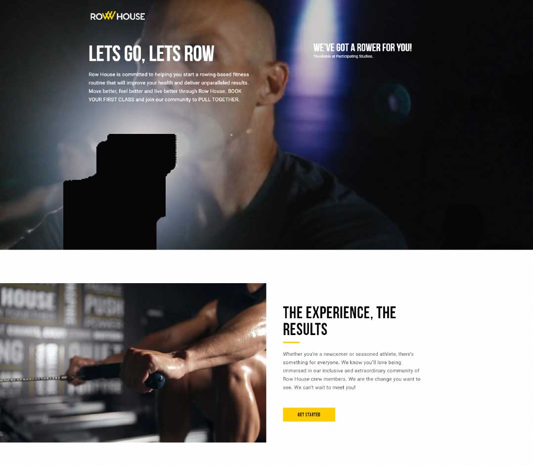
Publish eye-catching images and video
A landing page should NOT contain too much copy; you also need to balance copy with images and videos. Your information should be presented in an organised, skimmable manner, with plenty of visual elements to balance wording out.
Your images and videos should represent your target audience. They should tell a story, helping to differentiate your brand through the promotion of its unique elements. They should help to strengthen your message, persuading your users to convert.
Use trust signals
Trust signals are important for landing page conversion, building credibility in your product, service or brand. Make these stand-alone features, rather than embedding them in other content, so they stand out.
Use pictures and incorporate logos, wherever possible, to ensure this influential information doesn’t get missed. Trust signals include:
- Customer quotes, case studies and reviews
- Influencer endorsements, including the media
- Data to quantify the quality of your offer
- Third-party awards, even if it’s only reaching the finals
Remove distractions
A landing page should eliminate distractions by removing navigation, competing links and alternate options.
You’ll then capture your visitor’s undivided attention. And this means you can guide them where you’d like them to go – to your most important brand messages and your call-to-action (CTA).
Your CTA is the wording you use to prompt an immediate response from your user, for example, purchasing a product or booking an event. See more about this below.
Create a persuasive offer for your CTA
Your call-to-action (CTA) offer is an important element of your landing page.
It’s the item you give in exchange for your lead’s personal information or to encourage them to click through to more content on your website. It needs to be persuasive and relevant to your business.
Your CTA offer could be a high-quality brochure, an event or webinar, a sales discount or something else entirely.
Ideally, it should be more than simply signing up for your mailing list, however, this can also work if you have nothing else to give.
The language you use to position your offer can make all the difference. Use a headline and compelling copy to describe your offer, as well as a friendly tone of voice to help you build brand loyalty:
- Discover more at our virtual open event, designed to help you find out if we’re the right fit for you will be more persuasive than Book your place at our open event.
- Order your prospectus, designed to give you a taste of living and learning at our amazing university will be more influential than Order a prospectus.
- Our experts are on hand to help you make your university decision will be better than Submit your question here.
- Join our community to receive exciting news and updates about student life will convert more users than Sign up for emails
Create a stand-out CTA button
Your CTA button needs to stand out, meaning you should use a colour that contrasts with other elements on the page.
Be clear about what you want visitors to do – use an action verb that spells it out, like Submit here, Book now, Download or Get it now.
You can add your CTA button more than once on your page. This will enable users to convert when they want to.
You can also trial different wording, but keep your button text short. Test the effectiveness of action-focused and benefit-focused messaging. For example, if you want your users to book an open event, you could try Book now, as well as Meet us in person or Discover our world.
Again, these are just quick examples to help you understand how to apply this guidance. Do spend some time developing your own persuasive versions relevant to your business, your advertising idea and your offer.
Place your CTA high up on your landing page
Make every step as easy as possible for your audience. This means placing one of your CTAs high up on your page.
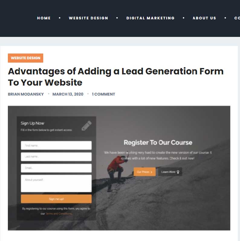
If you’re using a lead generation form, it should be embedded on the page; include the form or an anchor link to the form above the fold (bottom of the screen), in case your prospects want to convert right away.
Your form could even be designed to scroll with the user as they move down the page, although this can make content viewing difficult on mobile screens.
Only ask for what you need
Ask for as little information as you need in your lead form to create a low barrier to entry. A name and an email are more than sufficient to nurture a new lead, however, do liaise with your CRM (customer relationship management) team, if you have one, to ensure your data fields fit with what they need to collect.
Say thank you!
Your new leads should always receive a thank you message, via a pop-up box or a web page they’re directed to after submitting their information. Your thank you page serves three handy purposes:
- It provides an opportunity for you to thank your new lead for their interest – this can go a long way to conversion later on.
- It clarifies your offer and next steps, providing an opportunity for you to remind your user about the strengths of your brand.
- It enables you to direct your user to more relevant and exciting information, to move them further down your conversion funnel.
Optimise for search
Your page should be optimised with target keywords to help your paid campaign and organic website traffic. Then, when someone searches for your key phrase, it will increase the likelihood of them finding your page.
Similarly, when you target a keyword with paid ads, those words should exist on your landing page. Using keywords and phrases in headings is especially helpful – Google likes these, and your users will respond well too.
A word of advice though: don’t go over the top. If your keywords start to disrupt your messaging or the quality of your content, leave them out. You’ll only turn your readers off!
Two brilliant tools I use regularly to find trending keywords related to specific topics are FREE Google Chrome plugins:
Note, SEO is more complex than simply adding keywords (check out some great DIY SEO tips) and if you have a small website with a low domain score, you’re unlikely to compete with big brands who invest heavily in this kind of thing.
The most important thing is to ensure your content is relevant and interesting so that your users remain on your page and convert!
Evaluate and improve
Once you’ve launched your landing page, you’ll want to know how it’s performing, so you can do more of what your customers are responding to.
Your ultimate success measure will be related to your CTA. Whether this is clicking through to more content or completing a lead generation form, be sure to measure and optimise performance using the tools below.
- Google Analytics will be your trusty tool for evaluating your website traffic – sessions, page views, click-throughs and more.
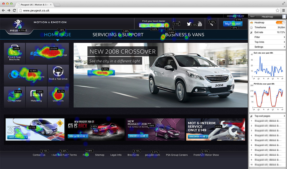
- Tools such as heatmap.com (free) will help you to understand on-page engagement in real-time without looking at lots of data. You’ll find all kinds of interesting insights to help inform new content and its placement on the page.
- Your CRM (customer relationship management) or data capture form software will enable you to track leads generated.
Make it accessible
Accessibility is an important part of developing content today. It basically means ensuring your content can be understood by everyone, including people with disabilities. The Web Content Accessibility Guidelines (WCAG) are the most-referenced set of standards in website accessibility governance today.
They’re organised by four main principles, which state that content must be accessible to all in four key areas: Perceivable (information must be visible to different senses), Operable (interfaces and navigation must be usable), Understandable (easy to understand) and Robust (compatible with assistive technologies).
There are some simple things you can consider when developing your content to ensure it’s accessible. Check out more about website accessibility for more thorough information.
- Always use plain English
- Use a font that’s easy to read
- Write unique page titles
- Use headings to structure your content
- Use descriptive text for links
- Always add text alternatives (alt text) to images
- Use tables only for tabular data